What's New
Latest updates and improvements
Easier to Find, Easier to Join
The Front Page Answers Questions Now
The landing page has a new section at the bottom: Frequently asked questions. What WirkSam costs, whether helpers need an account, who can see an event, how the reminders reach people, what happens to your data, whether you can reuse last year's event. These are the things people asked before they signed up, answered in one place instead of in a reply to each email.
The German Pages Have Their Own Address
The public pages now exist twice: in English at the usual address and in German
under /de. Send a German congregation the /de link and they land on German
pages, whatever language their browser is set to. The language switch on those
pages moves you between the two.
Links Look Like Something
Share a link to WirkSam in WhatsApp, Signal, Slack or an email, and the preview now shows a proper card: the roster board, the headline and what WirkSam is, in the language of the page you shared. Before, it showed a cropped screenshot or nothing at all.
No More Waiting on a Spinner
The landing page, the changelog and the terms now arrive as finished pages. They are on screen straight away instead of after a loading spinner, and in the dark theme they no longer flash white first. The same work makes them readable for search engines and AI assistants, so somebody asking one about volunteer shift planning for a church festival has a better chance of hearing about WirkSam.
Invitation Links Work Before You Have an Account
Opening an invitation link while signed out used to end in "invitation not found". Now you are offered to sign in or to create an account, and the invitation comes along: once you are through, you are in the event.
"Du", Everywhere
The German version had been mixing "du" and "Sie" depending on which screen you were on. It now says "du" throughout, including the notification emails, which also lost the last of the old wording like "Taskgruppe". The privacy policy and the terms stay formal.
For Anyone Running Their Own WirkSam
Self-hosted installations get a few new settings. Signup can be limited to invited people, to certain email domains, or to accounts an administrator has approved. The landing page can be switched off, so the address leads straight to sign-in, and search engines can be asked to stay away from a private installation. All of it is described in the deployment guide; with nothing changed, an installation behaves as before.
Run It Again Next Year
The Same Event, On New Dates
The summer festival you ran last July is the summer festival you will run next July. Until now the app had no opinion about that: you started an empty event and rebuilt the cake counter, the grill, the entrance desk and the clear-down from memory, one shift at a time, while last year's version sat right there in your event list.
Now every event you administer has Copy this event. Give the copy a name and a start date, and everything underneath moves with it — tasks, their shifts, their times, the lot. The original is not touched. It keeps its dates, its shifts and its sign-ups exactly as they are; what you get is a separate new event standing beside it.
The new start date defaults to the same weekday a year on, because a festival that ran on a Saturday needs to run on a Saturday. Move it anywhere you like and the whole plan follows.
You Choose What Comes Across
The second step is a list of last year's tasks with their shift counts, all ticked. Untick the ones that are not coming back. The Kids' Corner that only happened because somebody volunteered to run it, the stall that rained off — leave them behind.
By default the shifts come across exactly as they were, down to the times somebody adjusted by hand on the day. If a task should be laid out differently this year, switch it to Plan the shifts again and set the hours, the length and how many people you need; the screen shows you the shifts it would build before anything is created.
Each task can also be adjusted on its way over — renamed, moved, re-dated — and you can see the exact list of shifts the copy will contain before you commit to any of it.
What Deliberately Stays Behind
Last year's sign-ups do not come with the copy. Neither do the availability people entered, the invitations that were still open, or anyone's requests to join. The copy arrives with empty shifts, which is the point: it is next year's rota, not a record of last year's.
The people, though, usually are the same people. Bring the same people across is on by default and carries the roster with their roles intact, so you are not re-inviting thirty volunteers by email. Nobody is told anything unless you ask for it on the last step — and if you do, they get one message about the event rather than one per task.
A Copy Starts Quiet
Tasks come across as drafts, so nobody can book a shift in a plan you are still working on. When a task is ready, publish it from the new event and it opens for booking then. If you would rather a task be open from the moment the copy exists, say so while you are setting it up.
The Demo Says Hello First
A Greeting, and a Choice
"Try a demo event" used to drop you straight into a guided tour that had already started. Nobody had asked for it, and the first thing it did was dim the screen you had come to look at.
Now the demo opens with a short hello instead: which festival you have landed in, what your side of it is, and the one thing worth saying out loud — the event is yours alone, nobody else sees it, and it disappears with the clock at the top along with everything you got up to in it. Then it asks. Yes, show me round starts the tour; No thanks, I'll explore leaves you with a clean, undimmed app and no tour at all. Changing your mind costs one click: the demo banner offers the tour for as long as the demo lasts.
The Tour Starts Where There Is Something to See
The tour's first step used to highlight the page heading, which is a word you can already read. Both tours now open on something worth pointing at: your next shift if you are a volunteer, the panel of what needs you if you are organising. Nine steps and ten, one shorter each than before, because the hello is no longer one of them.
Plainer Words Throughout
Every step has been rewritten shorter and more plainly, in both languages. The talk about none of it being real is gone from the tour entirely — the greeting and the banner say it once, properly, and the tour gets on with explaining the product.
A Second Demo Gets Its Own Start
Trying the volunteer demo and then the organiser one in the same tab used to carry the first tour across mid-sentence: an organiser being told what they were already down for as a volunteer, and never greeted at all. The second demo now starts clean, with its own hello.
The Demo Explains Itself
A Tour That Makes an Argument
"Try a demo event" drops you into a festival that already has four jobs, a schedule and a handful of volunteers, and a guided tour starts on its own. That tour used to read every label on the screen to you. It now explains one idea at a time, in four short chapters, and the screens are the evidence rather than the subject.
The idea it is explaining is the one thing worth knowing about WirkSam: a job is something that has to be covered over a stretch of time, a job is cut into shifts, and a shift is what a person actually takes. Once that lands, the rest of the app reads itself. The volunteer's tour is ten steps and the organiser's is eleven — both shorter than what they replace, and both ending on what you can press next.
Buttons That Say What They Do
The button that moves the tour along used to say "Next" whether it was moving to the following sentence or opening a dialog, jumping to another page, or unfolding part of a form. Now it says which: Open this shift, Create a job, Show me the preview, See my shifts. Nothing happens to the page that the button did not warn you about first, and the tour scrolls to where it is going and waits for the page to settle before it points at anything.
Taking a Shift Actually Works
The step that shows you how to take a shift is the point of the whole demo, and it was broken. It opened whichever shift happened to be first on the board, which was reliably one that was already full — so most visitors were shown a booking button that was not there, and the rest got an error if they pressed it. The demo now keeps a shift free for you, the tour opens that one, and pressing the button books it.
Cancelling works too. Demo visitors could book a shift and then find no way to hand it back, because the app was recognising "your" bookings by email address and demo accounts do not have one. It recognises you properly now.
If you try the volunteer demo and then the organiser demo without closing the tab, the second one gets its tour as well. Previously it started in silence.
Aufgaben, Not Veranstaltungen
In German, tasks were called Veranstaltungen — the same word the app uses for the event that contains them. The sidebar, the create form and the breadcrumbs all said it, so a tour explaining that an event contains tasks was pointing at two different things wearing the same name. Tasks are Aufgaben now, and Veranstaltung means the event and nothing else. The bottom bar on a phone had also never been translated at all.
A Dark Theme of Its Own
Brown Was Never the Plan
WirkSam's light theme is warm on purpose — cream paper, forest green, a little terracotta. The dark theme was made by taking those same colours and turning the lights down, which sounds sensible and is not. Warmth at full brightness reads as paper. The same warmth at a tenth of it reads as mud, and so every card, every sidebar and every panel in the app carried a brown cast that nobody had chosen.
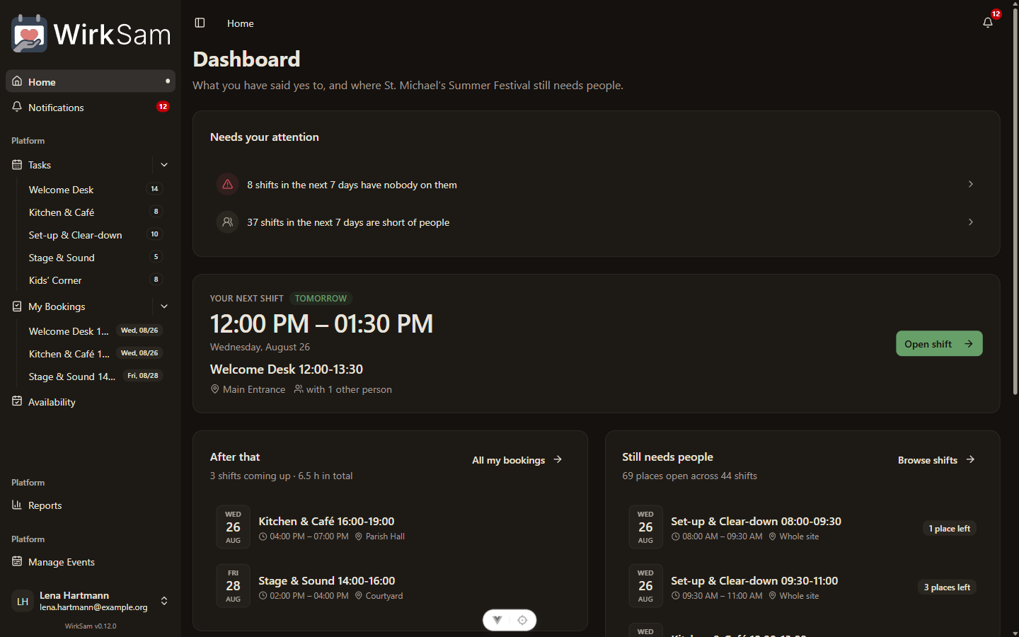
The dark theme is now its own thing rather than a dimmed copy of the light one. Its greys lean very slightly green instead of very slightly orange, which leaves the green itself as the only real colour on screen.
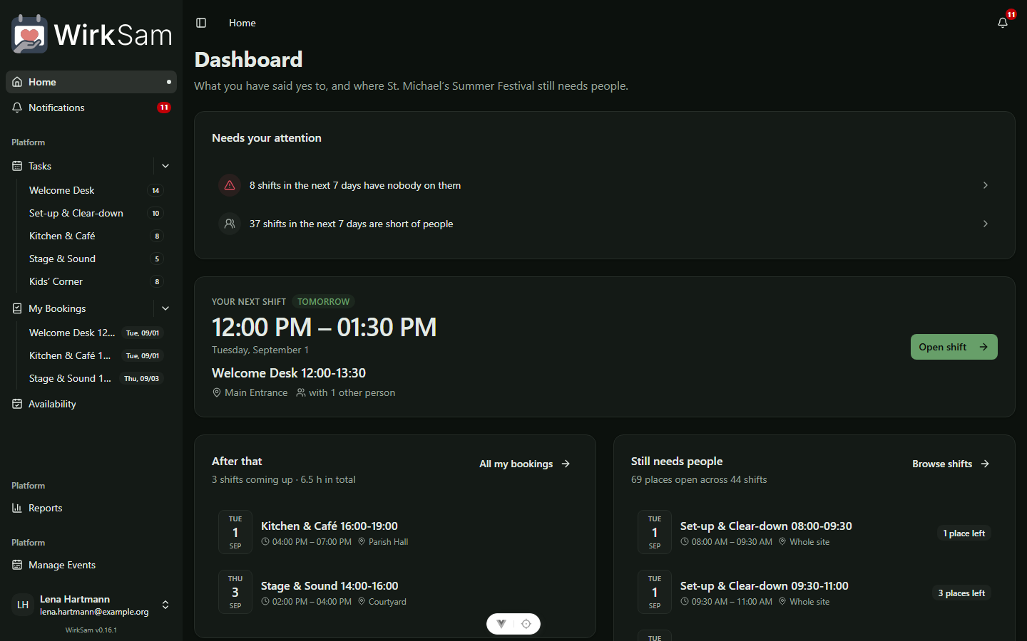
The light theme has not changed. Cream is still cream.
Where the Warm Ink Went
A few small things were written in terracotta rather than merely sitting on it: the two handles you drag to set your hours on the availability screen, and whichever section you have open in settings. Terracotta text is a pleasant colour and a poor one to read, so those are plain text now — dark on the light theme, light on the dark one.
The two theme previews in your settings also tell the truth again. Each one shows a dot in its palette's own signal colour, and on the black-and-white theme that dot had been a pale grey on a white card — technically present, practically invisible.
Details That Fit In Your Hand
The Shift Says What It Is
Opening a shift used to greet you with the words Shift Details in bold — a label, telling you what you already knew, on the screen you had just chosen to open. The thing you were actually looking for was underneath: the job's name in small grey text, and the day and time as the third and fourth of five identical rows.
Now the job's name is the heading, and the day and time are the line under it.
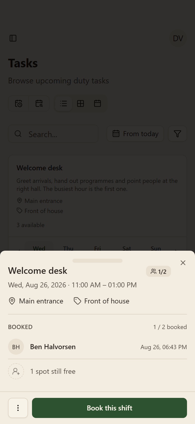
Where and what have moved onto one line instead of two paragraph-sized blocks, and the number of places is stated once, next to the name, instead of twice in two different phrasings. On a computer the whole panel is about a third shorter than it was.
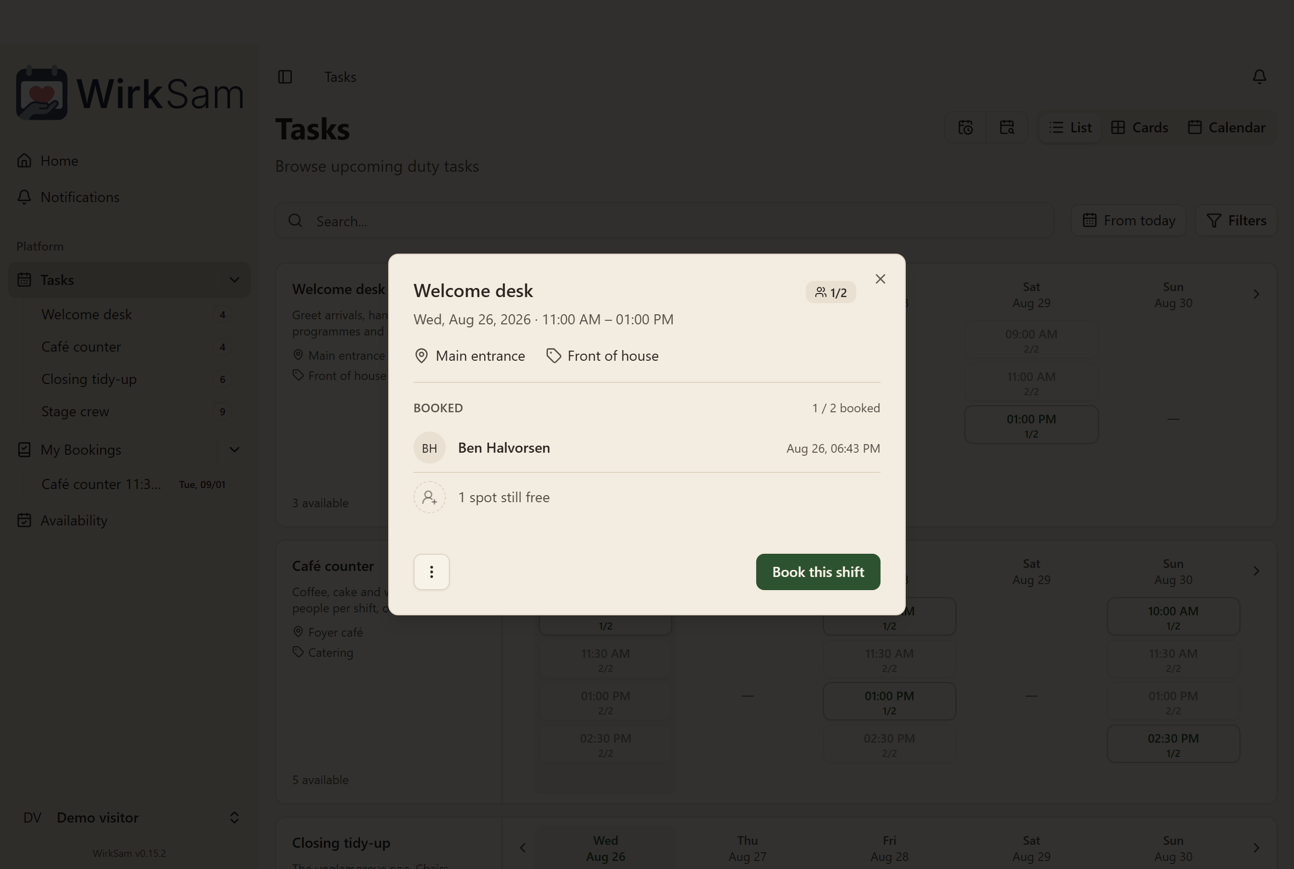
Who Is On It — And Who Is Not
The list of people underneath used to be a small spreadsheet: a bordered table with column headings, inside a panel that already had a border. It listed who had signed up and stopped there, so the places still waiting for somebody were something you worked out by subtracting.
It is a list of people now, with faces, and it ends by saying what is left — 1 spot still free — rather than leaving you to do the arithmetic.
Panels Come Up From The Bottom
On a phone, every panel in WirkSam used to open as a small box floating in the middle of the screen: too narrow to read comfortably, scrolling inside itself while the page behind it sat still, and with its buttons stranded halfway up the screen where your thumb is not.
They now rise from the bottom edge, full width, with the button you came for across the bottom where you can reach it. You can pull one down to dismiss it, or press the cross.
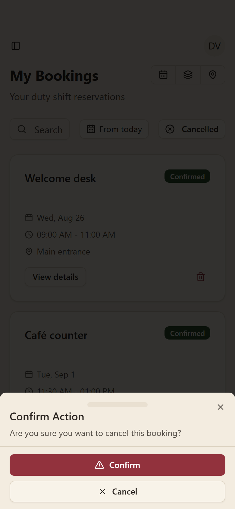
This is every panel, not just the shift one — confirming a deletion, adding a shift, cropping a profile picture, starting a demo. Questions that need a yes or a no put both answers across the full width, one above the other, so there is no small target to miss.
On a computer nothing about this changes. Panels stay centred, the way they were.
Where You Are Due Next
The Dashboard Answers Something Now
The screen you land on used to be a month calendar with everything painted onto it at once — your bookings, the jobs, the event itself, all in the same grid of coloured bars. It looked like an overview. It was not one.
Two questions bring people to that screen. Am I due anywhere? and where are people still missing? Neither could be read off the calendar. Both meant opening days one at a time and counting.
So the calendar is gone from the home screen, and the dashboard says those two things out loud instead.
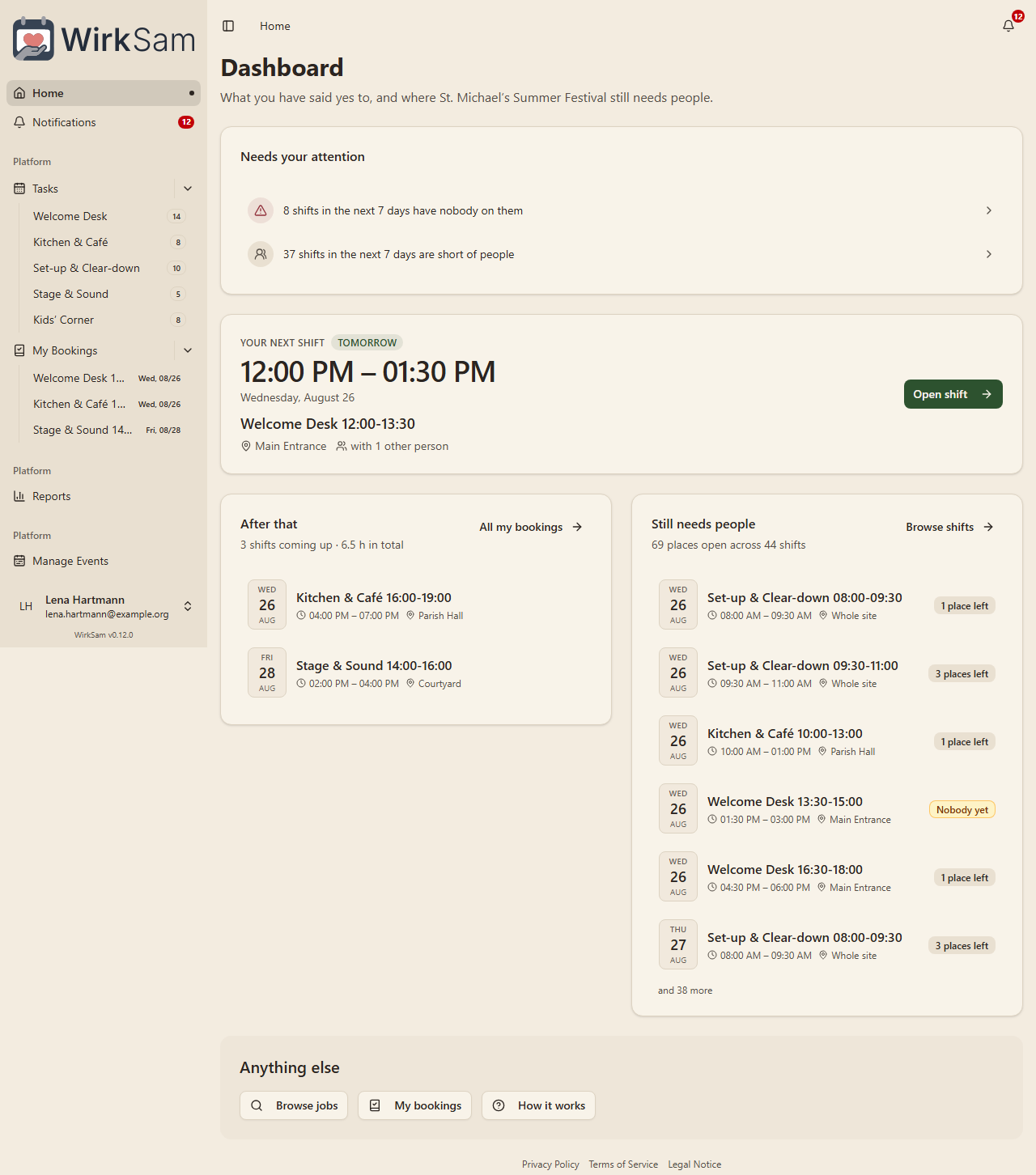
Your Next Shift, In Big Letters
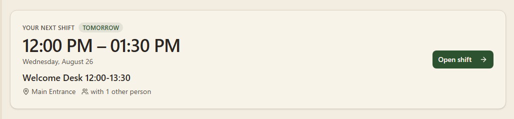
The largest thing on the page is the one fact you were checking: when to turn up. Under it, in this order, is everything you would want on the way out of the door — the day, which job it is, where to go, and who else will be there.
If you have nothing booked, the card does not simply say so and stop. It turns into the offer instead: how many places are still waiting for somebody, and a button that takes you to them.
Where People Are Still Missing
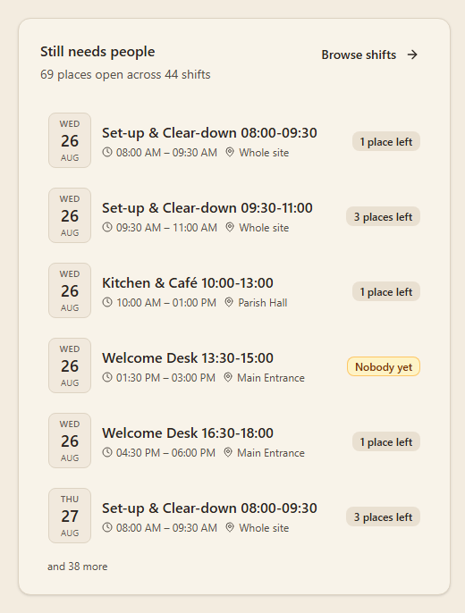
Every shift in your event that still has room, soonest first. Each one carries its time, its place and how much of it is left — 1 place left, 3 places left, or Nobody yet for the ones no one has touched at all.
Pressing any of them opens the shift, so you can take it without leaving the page. Shifts you are already on are left out; they are on the other list, and offering them to you again would just be strange.
Underneath your next shift, the rest of what you have said yes to is listed the same way, with the hours it adds up to.
If You Are Running The Event
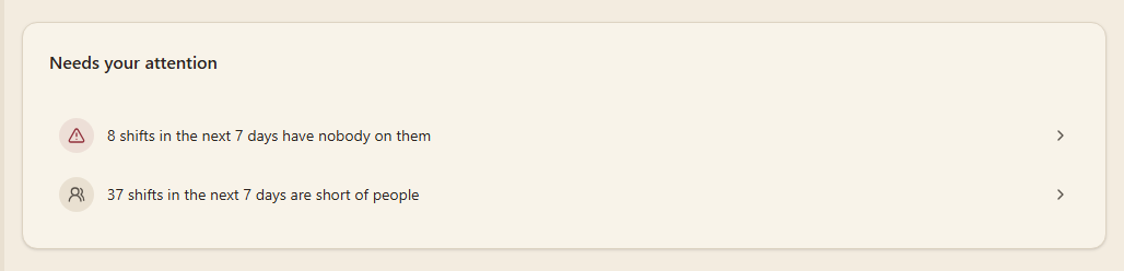
Organisers get one more block, at the very top: the things this week that are waiting on a decision from you. Shifts in the next seven days with nobody on them, shifts still short of people, anyone asking to join, and jobs still sitting in draft.
Each line is a link to the screen where you would do something about it. When there is nothing to report the block is not there at all — an empty "needs your attention" panel just teaches people to stop reading it.
If you only help out at an event, none of this appears for you.
On A Phone

The same page, in one column, in the same order: what needs you, when you are next due, what is left to cover. No sideways scrolling, no calendar grid squeezed into 390 pixels.
The Calendar Is Still There
It just lives where it is useful. Tasks has had a month, week and day view all along, with the filters and the date navigation that make a calendar worth having. Nothing about it changed — it simply stopped being the first thing you see.
One last thing, for anyone with a foot in more than one event: the shifts you have booked are listed across all of them, whichever event the switcher is pointing at, and any that belong somewhere else say so. A duty you promised to turn up to should not go quiet because you were looking at something else.
Have a Look Around First
Try It Before You Sign Up
Until now the only way to find out what WirkSam is like was to make an account, make an event, and fill it with shifts — a fair amount of work to do before you know whether the thing suits you at all.
There is a third button on the front page now: Try a demo event. One click and you are inside a working event, with jobs, a schedule, a few volunteers and some shifts already taken. No account, no email address, nothing to fill in.
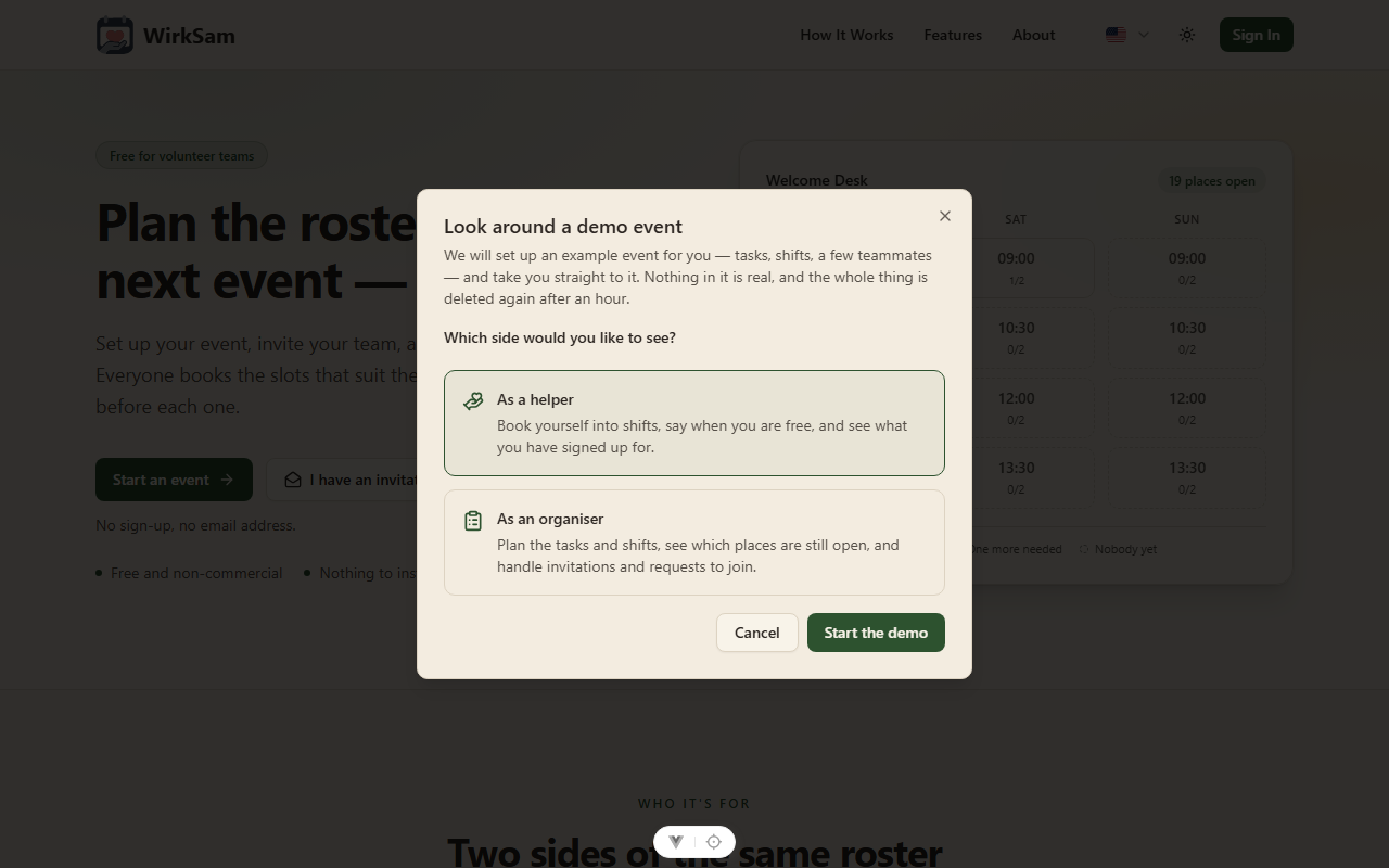
The event is made fresh for you when you press the button, and it is dated around today — so the calendar has this week in it, some shifts have already happened, and some are still waiting for someone.
Two Sides, Because There Are Two Jobs
WirkSam is used by two kinds of people, and they see different things. So the demo asks which one you are.
As a helper you get the volunteer's view: find the shifts that need someone, put your name on one, say which days you are free, and check what you have signed up for.
As an organiser you get the other half: create a job, generate a whole schedule of shifts from it in one go, see at a glance which slots are still empty, handle who is in your event, and read how it went afterwards.
You can start a second demo as the other side whenever you like.
Somebody Shows You Around
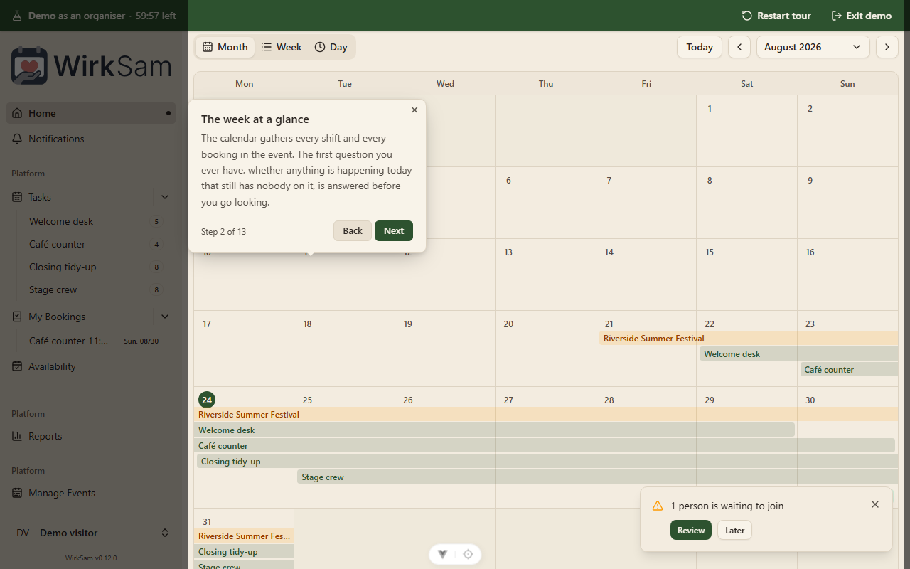
The demo does not just drop you in and wish you luck. A short guided tour walks you through the screens in the order you would actually use them, one step at a time, moving you between pages as it goes — nine steps for the helper's side, thirteen for the organiser's.
You can leave the tour at any point and simply poke around instead. The bar along the top has a Restart tour button for when you want it back.
It Tidies Itself Up
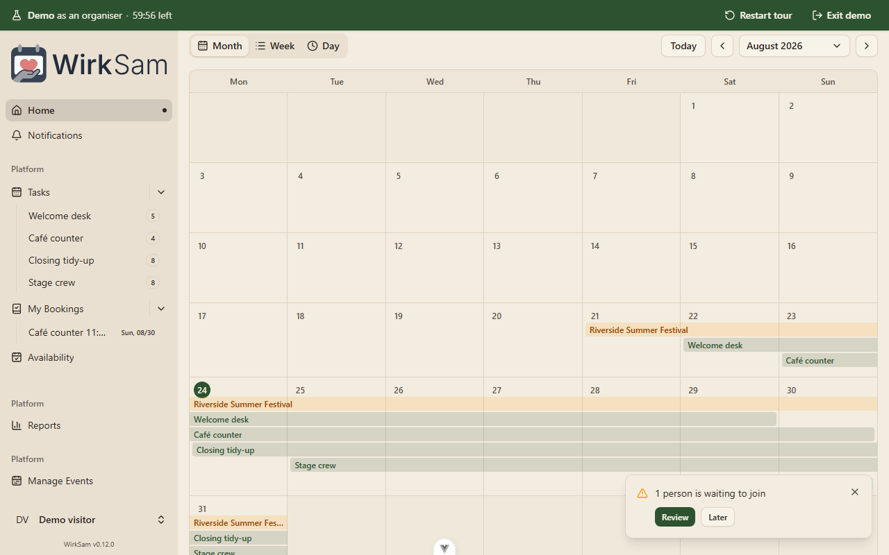
The demo lasts an hour. The bar at the top counts down, and when the time runs out the event and everything in it is deleted — the shifts, the bookings, the made-up volunteers, and the temporary account it all belonged to.
If you are done before then, Exit demo removes it straight away. Either way nothing is kept, nothing is shared with anyone else, and nothing you do in there touches a real event. It is genuinely impossible to break anything.
Nobody but you can see your demo. It does not turn up in the list of events to discover, it is not something anyone can be invited to, and — the one thing worth saying plainly — the demo cannot send email. The organiser's tour visits the invitation screen and shows you how it works, but the send button is off.
Running Your Own WirkSam
The demo is on by default. If you host WirkSam yourself and would rather not
have it, SANDBOX_ENABLED=false switches it off, and the button stops being
offered on the front page. There are two more settings for how long a demo
lasts and how many can run at once; both have sensible defaults and most
installations will never need to touch them.
A Page of Its Own
Starting an Event Has a Page Now
Creating an event used to happen in a dialog — a box over the top of whatever you were already looking at. On a phone it did not fit. The form ran off the bottom of the screen, the button that actually creates the thing sat below the edge, and the two date fields, squeezed side by side, had both shrunk to "Pick a dat…".
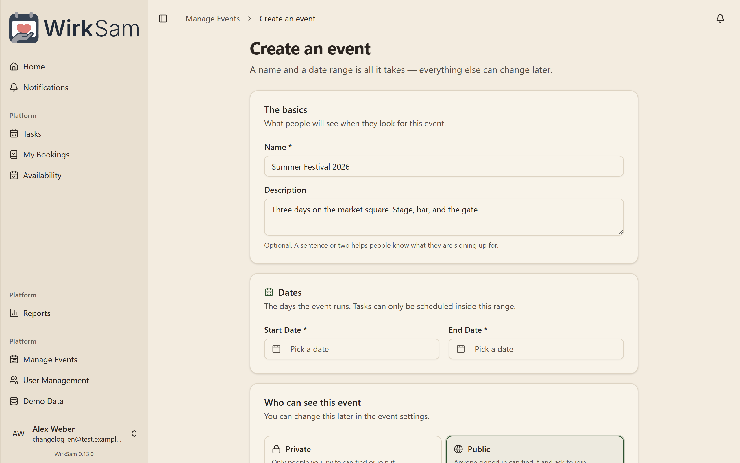
It is a page now, with room to breathe: what the event is called, when it runs, and who can see it. Each of those is its own block instead of one long stack of fields, and nothing hides behind a scrollbar inside a box.
Less to Read Through
The default time window — the hours the availability grid opens on — was the largest part of the old dialog and the part almost nobody fills in. It is folded away now, under a line that says what it is currently set to. Open it if you want it. Ignore it and it reads "availability covers the whole day", which is exactly what happens.
On a Phone
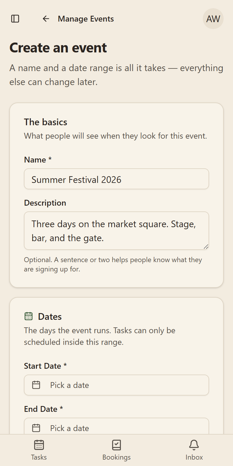
The two date fields sit one above the other, so each shows a whole date rather than an ellipsis, and Create is where every button on a phone should be: at the end of the form, across the full width.
Accounts for People Only
Anyone can sign up for WirkSam — that is deliberate. But an open form is also an open invitation to a script, and nothing stopped one from making accounts all afternoon, sending a verification mail to a different stranger each time.
Registration now sits behind a Cloudflare Turnstile check: the box that usually ticks itself while you are still reading the rest of the form. If it cannot tell that you are a person, no account is created and no mail goes out.
This is something each WirkSam installation switches on. Until whoever runs the server sets it up, the check is off — so a copy of WirkSam running on somebody's laptop does not need it.
Smaller Touches
- A start date after the end date is no longer possible: the two fields limit each other, and the page tells you how long the event comes out.
- An event you create is live immediately. Creating one from the management list used to leave it a draft that nobody else could see.
- Creating an event from the event picker brings you back to the picker with the new event already selected, ready to carry on with.
- In German the button said "Veranstaltungsgruppe erstellen", a word the rest of WirkSam dropped a while ago. It now says "Veranstaltung erstellen".
A Front Door Worth Looking At
Signing In and Joining, Redrawn
The sign-in and registration screens used to be a small box floating in the middle of an empty page. They are now a proper two-panel screen: what WirkSam is for on one side, and nothing but the form on the other.
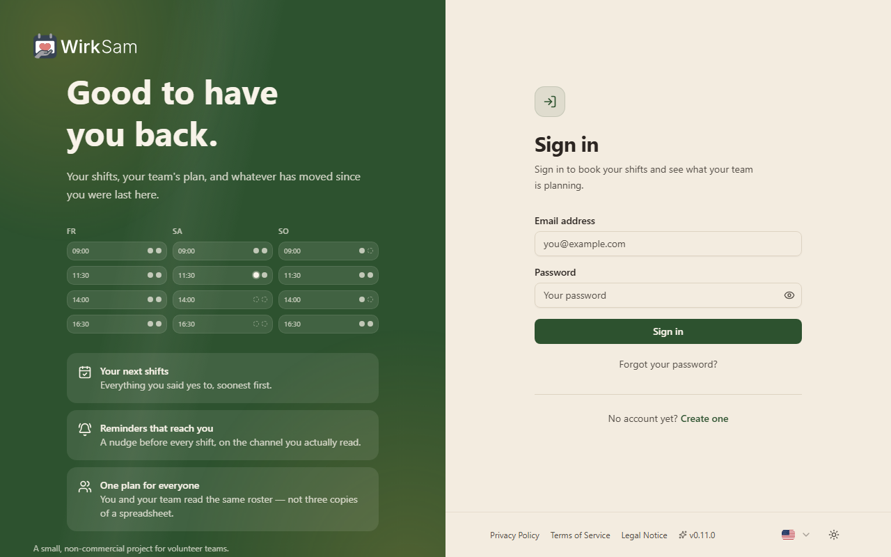
The panel on the left is not decoration for its own sake — it shows the thing the app is actually about. Days across, shifts down, and the places on them filling up, which is what your event looks like once your team gets going.
Creating an Account
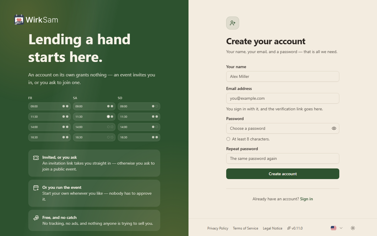
Two things are different beyond the look.
- You type your password twice. A typo in the one field you cannot read back used to mean finding out at your next sign-in. The second field catches it while you are still on the page.
- The password rule is stated once. There is a single line under the field that shows what is needed, ticks over when you have met it, and turns into the problem if there is one — instead of the same sentence printed twice, once as a hint and once as a complaint.
The Forms Speak Your Language
If you had WirkSam in German and left a field empty, it used to answer "Invalid input" — in English, in the middle of a German page. Every message a form can give you is now written in both languages, and it says something useful: an empty box asks to be filled in rather than being called invalid.
Errors are also finally the colour of an error. They were being drawn in the same colour as ordinary text, which is a poor way to tell somebody something went wrong.
Less Shouting While You Type
The forms used to go red as you typed the first letter of your email address — telling you that you were wrong before you had finished being right. They now wait until you leave a field before saying anything. Once a field is showing a problem, it does keep watching, so the message clears the moment you fix it.
On a Phone
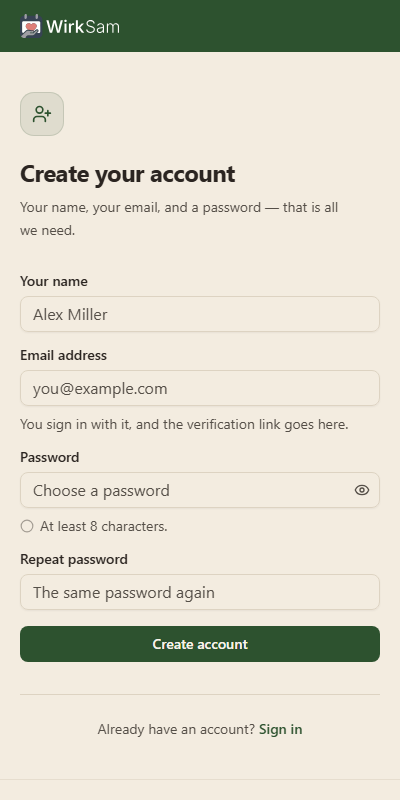
The panel folds down to a slim band with the logo in it, so the first field is where your thumb already is rather than below a screen of introduction.
Smaller Touches
- The privacy, terms and imprint links, the language switch and the light/dark switch are all on the sign-in screen now. You can change the language before signing in, which matters if you cannot read the page you are looking at.
- Submitting a form with something missing puts the cursor in the first field that needs you, rather than leaving you to hunt for it.
- The show-password eye sits inside its field instead of on top of its border.
- The dismiss buttons on the cookie notice were being swallowed by an invisible layer over them. They work.
- Nothing about your events, shifts or bookings changed. As with the last release, this one is about the way in.
Signing In Without Leaving
Sign In Stays In WirkSam
Signing in used to hand you over to a different website. You clicked "Sign in", the address bar changed to somewhere that was not WirkSam, you typed your password there, and it sent you back.
Now the sign-in form is simply a page in WirkSam, in your language, in your theme. You never leave, and the address bar never changes to something you did not expect.
Creating an Account
Registration asks for your name, your email address and a password, and that is the whole form. You are signed in the moment it is done — no confirmation step standing between you and the app.
A message goes to your address so you can confirm it. You do not have to act on it before you start using WirkSam; it is there so we know the address is really yours.
Forgot Your Password
There is a "Forgot your password?" link under the sign-in form. Give it your address and it sends you a link that lets you choose a new password. The link works once and expires after an hour.
For your safety, the page says the same thing whether or not it recognises the address. Someone who is not you cannot use it to find out who has an account here.
Your Password and Your Devices
Settings → Security is a real section now, rather than a link out to another site.
- Change your password. You confirm the one you use now, choose a new one, and every other device you are signed in on is signed out. The tab you are working in stays as it is.
- See where you are signed in. Each device shows what it is, when it signed in, and where from — with the one you are using marked. Anything you do not recognise can be signed out on its own.
Your Profile Is Yours Again
Your display name, nickname and short bio used to live on the other service. They are stored with the rest of your account now, which is why they save the same way everything else does.
Smaller Touches
- Following a link while signed out takes you to sign in and then on to the page you actually wanted, instead of dropping you on the home screen.
- Signing in and reloading keep you signed in. Closing the tab and coming back the next day does too.
- Passwords are at least 8 characters. If you use umlauts or emoji, a very long one may be refused — the form tells you rather than failing quietly.
- Repeated sign-in attempts from the same place are slowed down after a while.
- Nothing about your events, shifts or bookings changed. This release is about how you get in.
A New Front Door
The Public Page, Rebuilt
Everything an unregistered visitor sees has been rewritten. The old page led with a logo and three vague cards, then a carousel of eight screenshots you had to click through — and its text still described a WirkSam where an administrator had to set your event up for you.
The page now opens on what the product actually is: a roster board showing three days of shifts filling up, next to a plain description of what WirkSam does. The carousel is gone.
One Page Instead of Three
About and How It Works were separate pages that each repeated a slice of the same story. They are now sections of the landing page, reached by scrolling or from the header. The old addresses still work — they land on the matching section — so any link you have shared stays good.
A floating bar appears once you scroll past the top, showing which section you are in and jumping to any other.
How It Works, From Both Sides
The old page only ever explained one thing: the shift-generation wizard. It said nothing about creating an event, inviting anyone, or what taking part looks like.
Both journeys are now laid out end to end, four steps each, and you pick the side you are on:
- Organising — create the event, invite your people, generate the shifts, publish and watch it fill.
- Helping out — accept the invitation, say when you are free, book your shifts, get reminded.
Screenshots That Match What You See
Every screenshot on the page was recaptured, and they now follow your theme: light captures in light mode, dark in dark. Click any of them to open it full size, page between them with the arrow keys, and close with Escape.
The German screenshots were two releases out of date — still showing the old monochrome look and a "pending users" queue that no longer exists — and three of them were missing entirely, leaving broken images for German visitors. Both languages are now complete and current.
Smaller Touches
- The public pages scroll normally again. They used to be a fixed header over an inner scrolling box, which broke anchor links and the browser's own scroll restoration.
- Jumping to a section glides rather than teleporting, and respects your system setting if you have asked for reduced motion.
- No more burger menu on phones. The public page is one scrolling document, so the menu only added a step between you and the sign-in button, which now sits in the bar itself.
- The footer's legal links wrap instead of running off the edge of a narrow screen.
- Nothing about your account, events, or bookings changed — this release only touches the pages you see before signing in.
Start Your Own Event, Invite Your Own People
Anyone Can Start an Event
You no longer have to ask an administrator to set an event up for you. The "Create event" button on the event picker is there for everyone, and whoever creates an event owns it: you edit it, add tasks and shifts, and decide who takes part.
You Decide Who Joins
Each event now has its own list of people, on a new People tab in the event settings. Everyone taking part appears there with their role:
- Owner — created the event, or had it handed over. Can delete it and hand it on.
- Organiser — runs the event alongside the owner: tasks, shifts, members, invitations.
- Member — takes part and books shifts.
Owners and organisers can promote someone, remove someone, or leave the event themselves. The owner cannot be removed, so an event never ends up with nobody in charge — hand it over first, and you stay on as an organiser.
Invitations, by Email or by Link
Invite people by pasting one address or a whole list, and pick whether they join as an organiser or a member. Addresses that are already taking part are reported back and skipped rather than failing the batch.
Prefer a link? Create a share link instead and send it however you like — it stays usable until you withdraw it. Email invitations are single-use and go to the address you named; anyone opening one meant for someone else is turned away.
Either way the invitee gets a page showing the event, who invited them, and the role they would take, before they decide.
Private by Default, Public if You Want
A new event is private: only people you invite can find it or join. Switch it to public and it appears under a new Discover tab on the event picker, where anyone signed in can ask to join. Requests land on the People tab and the event's own organisers approve or decline them — nobody at WirkSam sits in the middle.
Signing Up No Longer Means Waiting
New accounts used to sit in a queue until an administrator approved them. That queue is gone: you can sign in straight away. An account on its own shows you nothing, though — you see an event once you create one, accept an invitation, or are let into a public one. The first screen after signing up opens on Discover, with recommended events first.
Smaller Touches
- Recommended events. Events picked out by a WirkSam administrator appear at the top of Discover, so a brand-new account has somewhere to start.
- Manage Events is now My Events, and it lists the events you run rather than being administrator-only.
- Reports are open to anyone who owns or organises an event, covering the events they run.
- The home screen's old "pending users" tile now counts join requests waiting on you.
- Nothing was lost in the move: your existing events stayed visible to everyone who could already see them, the people who managed an event became its organisers, and anyone who had booked a shift or entered their availability is now a member of that event.
One Event in Focus, Warmer Look, Smarter Inbox
Pick One Event to Work With
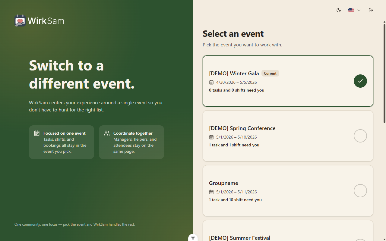
WirkSam now centres your view around a single active event. The first time you sign in, a new full-screen picker asks which event you want to focus on; from then on the app shows only that event's tasks, shifts, and bookings until you choose to switch. The "Change event" button on your settings page and a dedicated picker entry in the mobile menu both bring you back to the same screen.
A Warmer Default Theme
The app ships with a new earthy "Default" palette — cream backgrounds, forest-green accents, terracotta highlights — designed to feel less clinical for the volunteer-coordination context. The original monochrome shadcn look is preserved as "Classic" and is one click away. Light, dark, and system mode each work with both palettes.
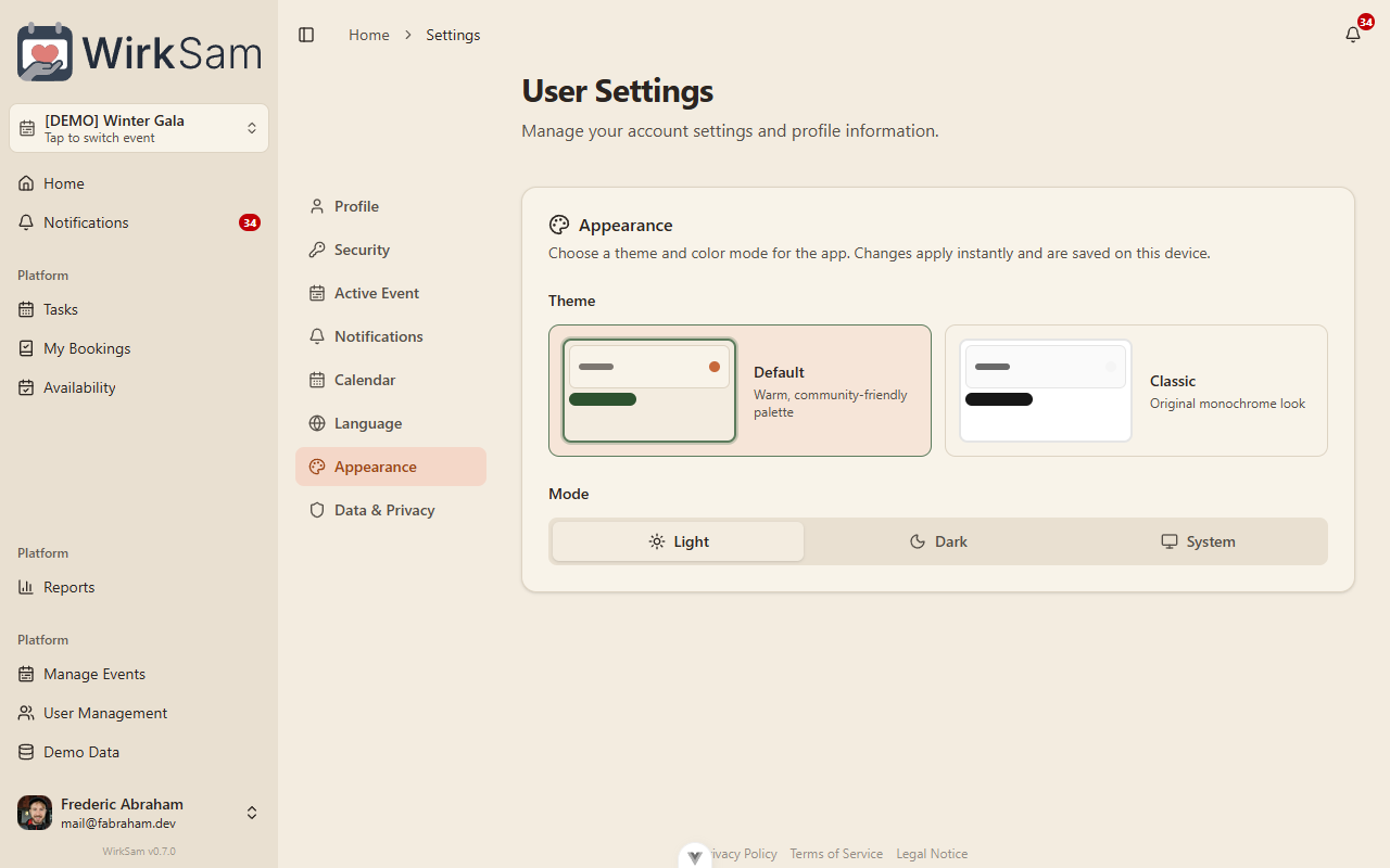
You'll also find a quick Appearance button in the public-page header so you can preview either palette before signing in.
Notifications, Reorganized
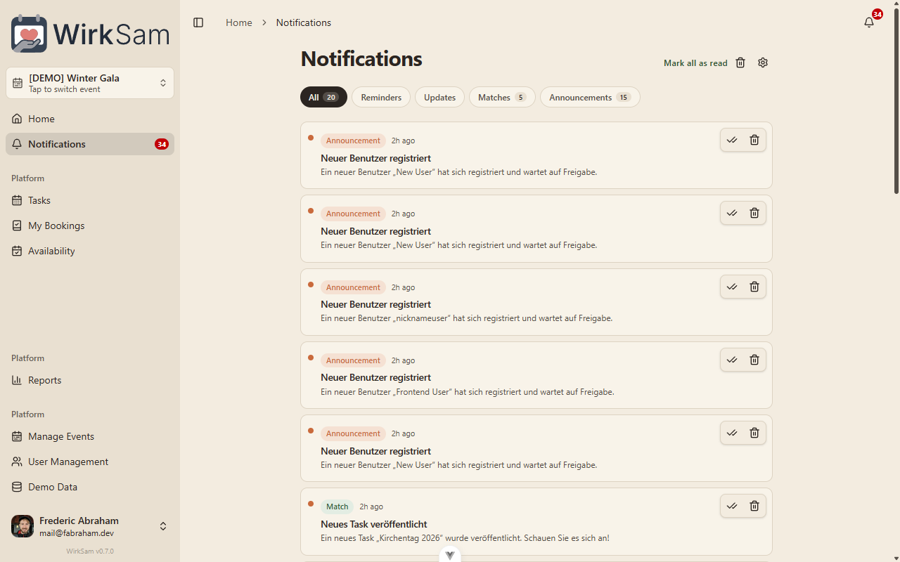
The notification inbox has been redesigned around how notifications actually feel: classification pills at the top let you flip between Reminders, Updates, Matches, and Announcements; mark-read and dismiss buttons are always visible (no more menus); and on touch devices you can swipe a row to read or dismiss it. Each row expands inline to show its action target. Skeleton loaders replace the empty flash on first open.
Availability Without the Dialog
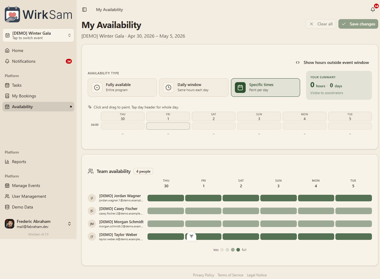
Setting your availability used to open a dialog stacked on top of the page; it now lives directly on the Availability view. Pick "Fully available", "Daily window", or "Specific times", paint your hours into the grid, and use the Save button at the top to commit. A new team-availability heatmap below shows at a glance who else is around on which days, with a clearer "less / full" legend.
Self-Hosted Profile Pictures
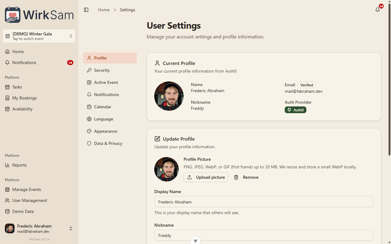
Profile pictures are no longer fetched from your identity provider. Upload any PNG, JPEG, WebP, or GIF (first frame); WirkSam crops, resizes, and stores a small WebP locally, so changing your picture works the same regardless of how you signed up. The Profile screen has a new picker with crop and rotate controls, and avatar updates appear instantly across the app.
Smaller Touches
- New Active Event and Appearance sections in user settings.
- Added a Time format preference (12-hour vs. 24-hour) saved to your profile.
- Optional sidebar event switcher: turn it on under Settings → Active Event to get a quick switcher card at the top of the sidebar; off by default.
- Mobile onboarding now slides between intro, event picker, and notification setup as a single horizontal flow rather than swapping panels in place.
- Existing event groups, events, and tasks were unaffected — only the way you navigate between them has changed.
Clearer Vocabulary — Events, Tasks, Shifts
Renamed Core Concepts
The three main things you work with in WirkSam have been renamed to match how people actually talk about the system. No behavior has changed — every button, page, and action works the same as before, just with clearer labels.
| Before | Now | What it means |
|---|---|---|
| Event Group | Event | A time-bounded container like a camp, festival, or season |
| Event | Task | A specific unit of work inside an Event (e.g. "Run kitchen") |
| Duty Slot | Shift | A bookable time block within a Task ("Saturday 14:00–16:00") |
The old words were ambiguous ("Event" and "Event Group" sounded almost the same) and one was technical jargon ("Duty Slot"). The new vocabulary reads naturally in both English and German — Veranstaltung, Aufgabe, Schicht.
What You'll Notice
- Sidebar and navigation labels use the new terms throughout.
- URLs have changed:
/eventsnow lists your tasks,/event-groupsis gone (use/eventswith the new meaning),/duty-slotsis now/shifts. Existing bookmarks to the old paths will need to be updated. - Notifications are titled with the new names ("Task Published", "Shift Starting Soon", etc.).
- All your existing events, tasks, shifts, bookings, and availability entries were preserved — only the names on top changed.
Under the Hood
The rename was applied as a single coordinated update across the backend, the database, the frontend, and the generated API client. The database migration also merges any duplicate notification types that the seeder may have created alongside the old ones, so no manual cleanup is required.
Group Managers & Scoped Permissions
Group Managers
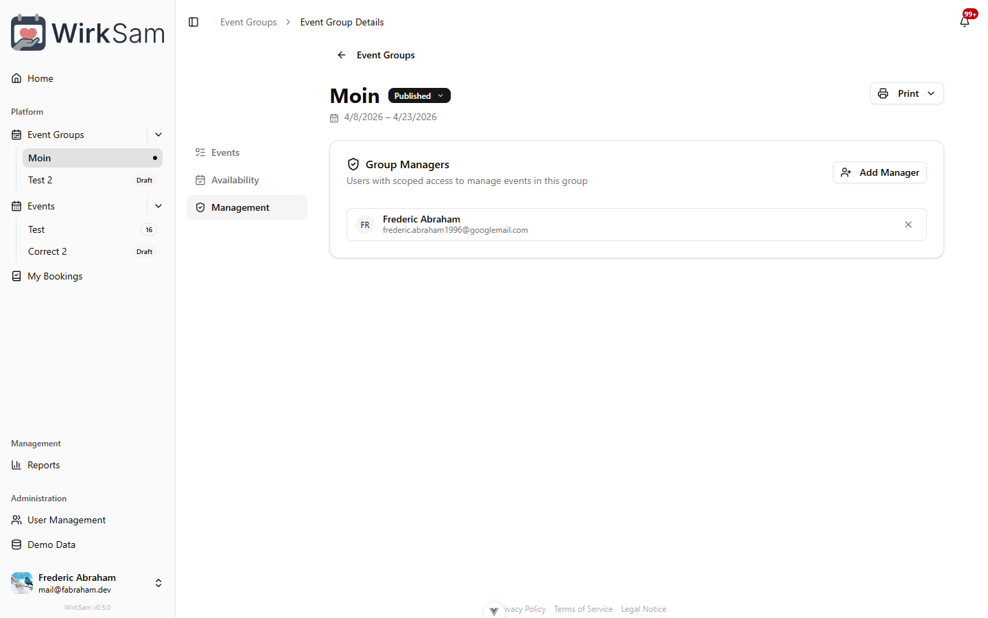
Admins can now assign dedicated managers to individual event groups. A group manager can create and edit events, view member availability, and access reports — all scoped to the groups they are responsible for, without needing full admin rights.
Open any event group, switch to the new Management tab, and search for a user to add them as a manager.
Redesigned Event Group Detail
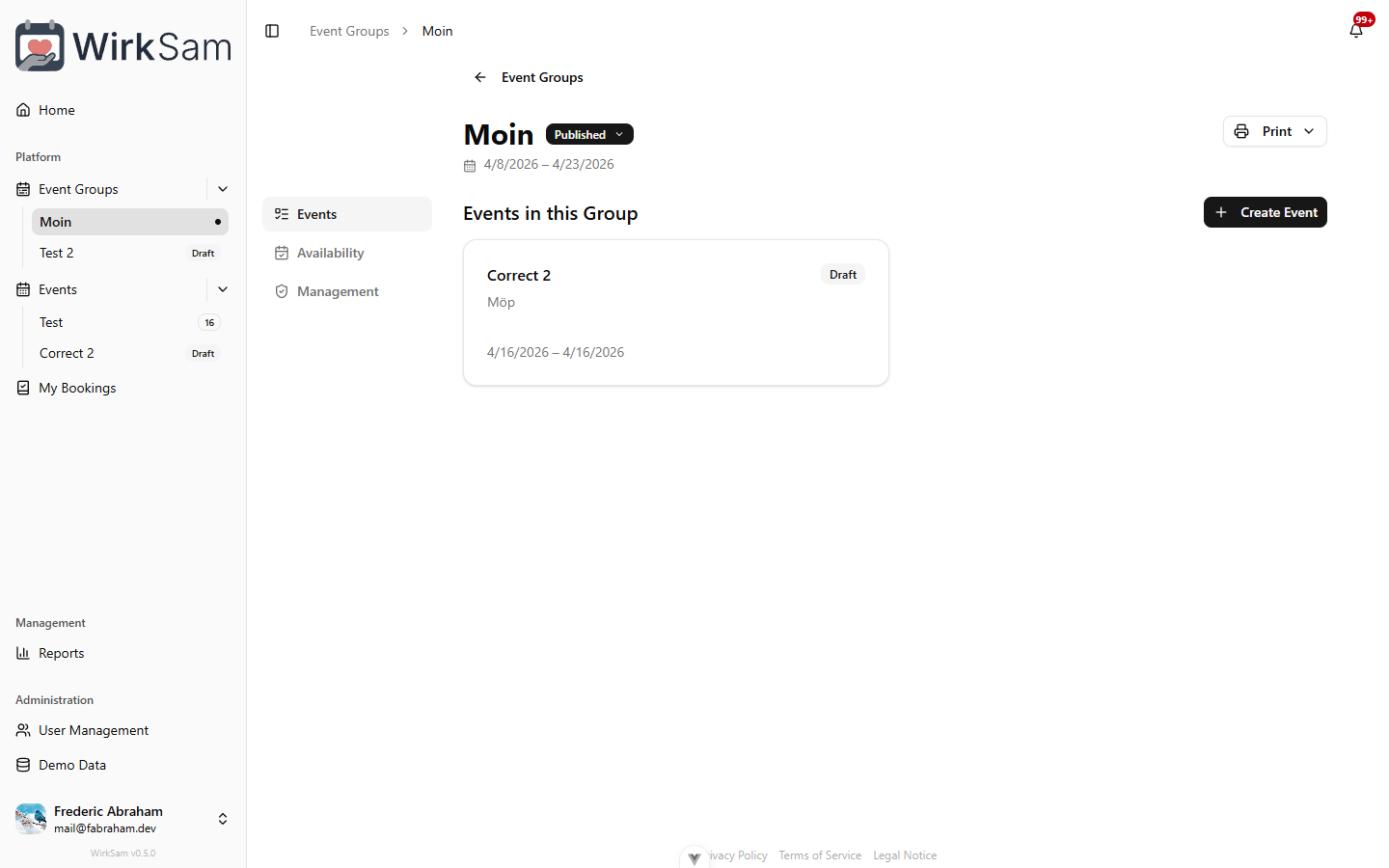
The event group detail page has been completely reworked. On desktop, a tabbed side navigation lets you switch between Events, Availability, and Management sections. On mobile, the same sections are accessible via swipeable chips at the top of the page.
Reporting for Group Managers
The Reports page is no longer limited to admins. Group managers can now access it too, with data automatically filtered to the events and groups they manage.
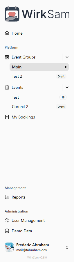
Sidebar Status Badges
Event groups and events that are not yet published now show a small status badge in the sidebar. This makes it easy to tell at a glance which items are still in draft or archived — and a tooltip reminds you that they are only visible to managers.
Admin Reporting Dashboard
Reporting Dashboard
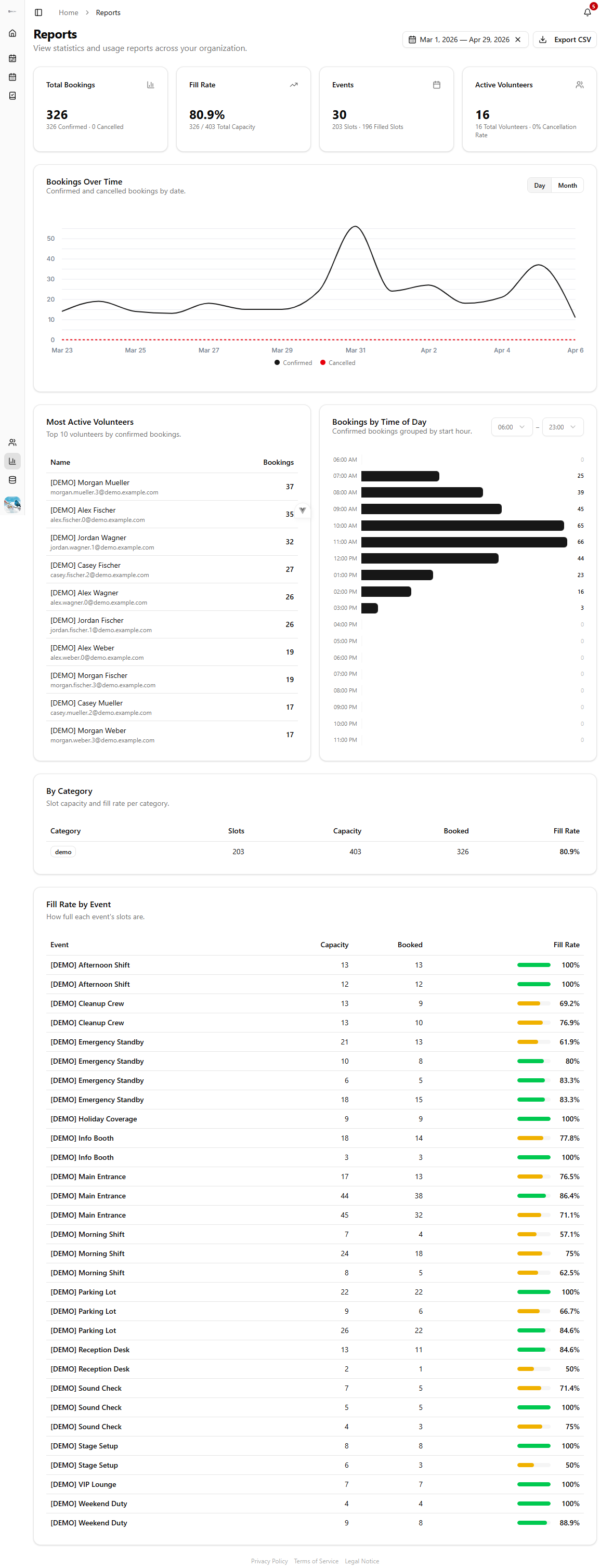
Admins now have a dedicated Reports page under the Administration section. It gives you a bird's-eye view of your organization's activity: total bookings, fill rates, event counts, and active volunteers — all at a glance.
Bookings Over Time
A line chart shows confirmed and cancelled bookings across your selected date range. Switch between daily and monthly granularity to spot trends or zoom into specific periods.
Busiest Times & Top Volunteers
See which hours of the day attract the most bookings and who your most active volunteers are. The top-10 leaderboard makes it easy to recognize dedicated helpers.
Category & Event Fill Rates
Two detailed tables break down slot capacity and fill rates — first by category, then by individual event. Colored progress bars let you quickly identify which events are fully booked and where there is still room.
Date Range & CSV Export
Filter all reports by a custom date range and export the data as CSV for further analysis or record-keeping.
Booking Reminders & Detail View
Booking Reminders
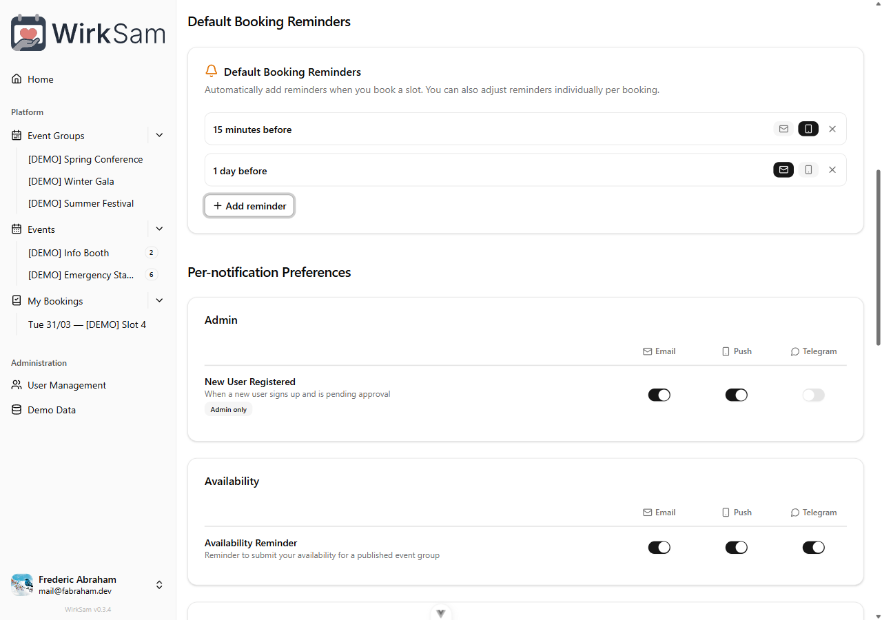
You can now set reminders for your bookings so you never miss a shift. Each reminder lets you choose when to be notified and through which channel — for example, a push notification 15 minutes before and an email 1 day before.
New users get sensible defaults out of the box: a push reminder 15 minutes before and an email reminder 1 day before each booking.
Booking Detail View
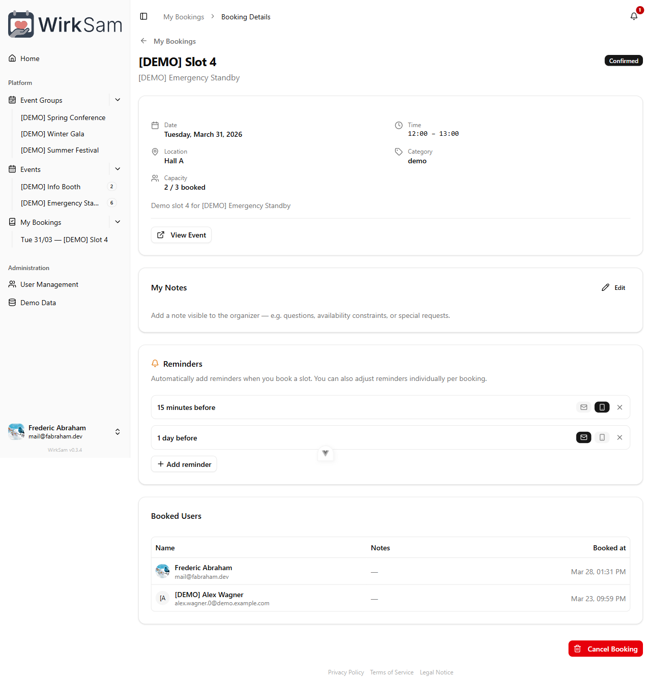
Clicking a booking from "My Bookings" now opens a dedicated detail page instead of the slot dialog. The new view organizes everything into clear sections: slot info, your notes, reminders, and co-bookers. Past events show a prominent banner so you know at a glance that it already took place.
Per-Booking Customization
Default reminders are just a starting point. On the booking detail page, you can add, remove, or change the delivery channel for individual reminders. This way you can get an extra early heads-up for important shifts or skip reminders for ones you won't forget.
Redesigned Settings Navigation
Sectioned Settings
The settings page has been redesigned with a new tabbed navigation. Instead of scrolling through a long list of cards, your settings are now organized into clear sections — Profile, Security, Notifications, Calendar, Language, and Data & Privacy. On desktop, a sticky sidebar lets you jump between sections instantly. On mobile, swipeable chips at the top let you navigate with a simple swipe or tap.
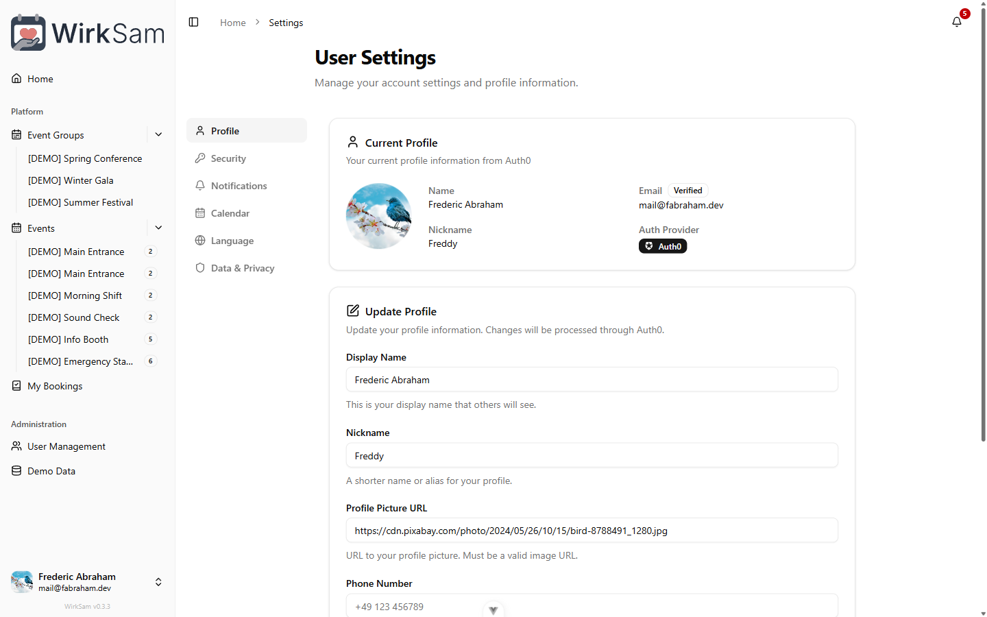
Improved Mobile Experience
Sectioned pages — including settings and the changelog — now use a swipeable chip navigation on mobile devices. The active section smoothly animates into view, and the page height adapts to the content so you never see unnecessary whitespace.
Auto-Save for Notification Preferences
Your notification preferences are now saved automatically as you change them — no more clicking a save button. A small indicator at the bottom of the screen confirms when your changes have been saved.
Deep-Linkable Settings Sections
Each settings section now has its own URL. You can bookmark or share a direct link to a specific section, and the browser back and forward buttons navigate between sections as expected.
Language Applies to Notifications
The language settings card now shows a hint that your language choice also applies to email notifications and other messages you receive.
Public Changelog
The changelog is now accessible without logging in. You can find a link in the footer of every page — look for the version number with the sparkle icon.
Calendar Sync & What's New
Calendar Sync
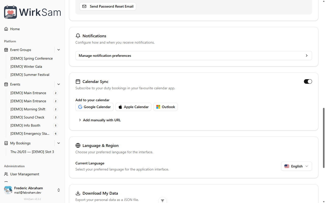
You can now subscribe to your confirmed duty bookings in your favourite calendar app. Head to your account settings and enable Calendar Sync to get a personal feed URL. One-click buttons let you add it directly to Google Calendar, Apple Calendar, or Outlook — or copy the URL and add it manually to any app that supports calendar subscriptions.
Your calendar will automatically stay up to date as bookings are added or changed, and each entry includes the event name, time, location, and a reminder one hour before.
What's New Page
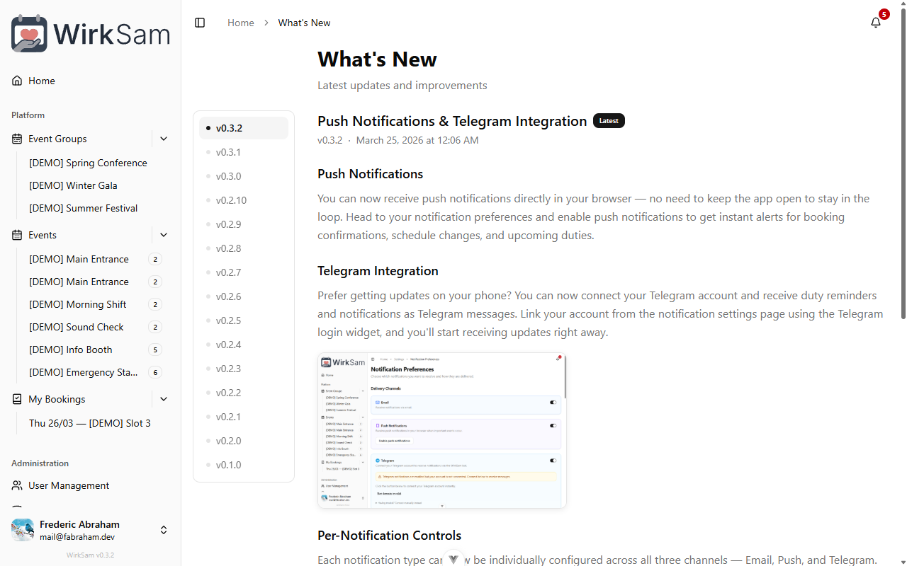
There's now a dedicated "What's New" page where you can browse the full version history of WirkSam. Each release is listed with its date and a summary of what changed — including screenshots where helpful.
When new versions are released after your last visit, you'll see a notification prompting you to check out what's changed. You can also reach the changelog anytime from the sidebar.
Localized Screenshots
Screenshots in the changelog now match your language setting. If you're using the app in German, you'll see German screenshots; in English, English screenshots.
Push Notifications & Telegram Integration
Push Notifications
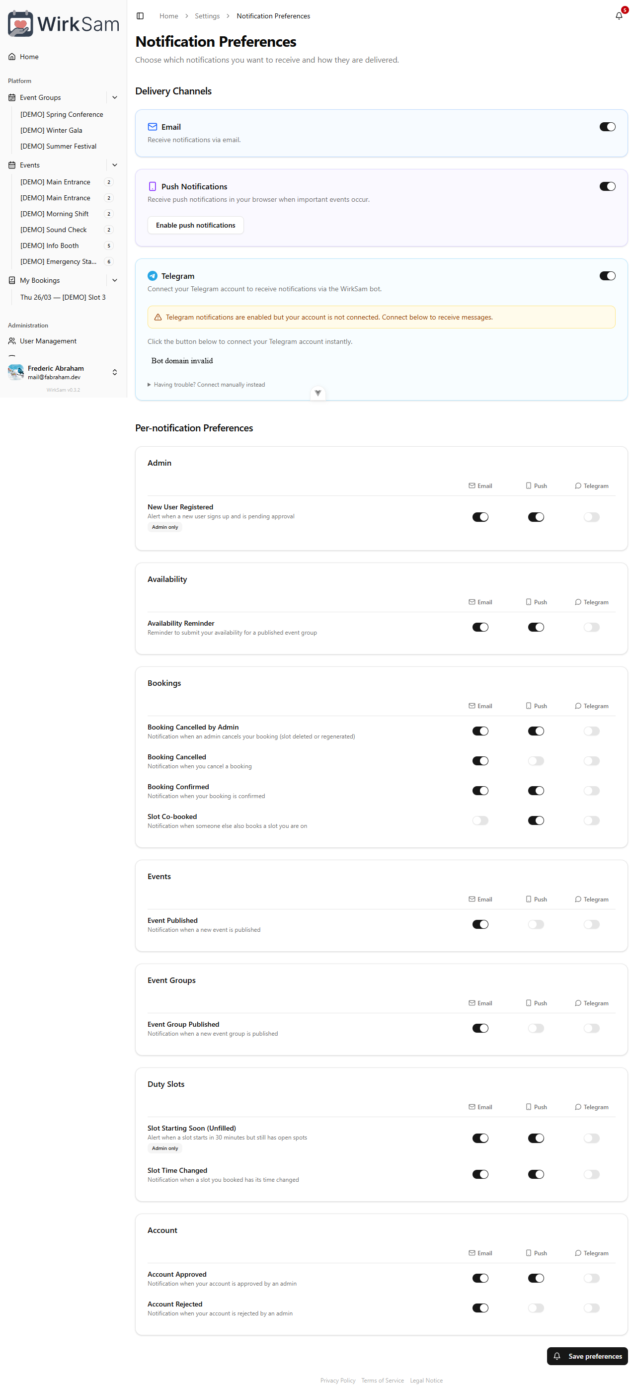
You can now receive push notifications directly in your browser — no need to keep the app open to stay in the loop. Head to your notification preferences and enable push notifications to get instant alerts for booking confirmations, schedule changes, and upcoming duties.
Telegram Integration
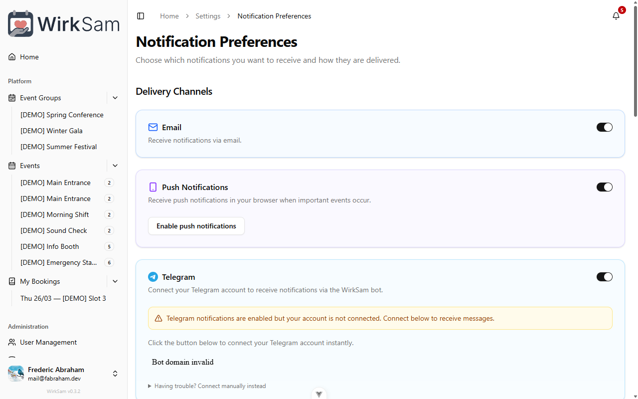
Prefer getting updates on your phone? You can now connect your Telegram account and receive duty reminders and notifications as Telegram messages. Link your account from the notification settings page using the Telegram login widget, and you'll start receiving updates right away.
Per-Notification Controls
Each notification type can now be individually configured across all three channels — Email, Push, and Telegram. Choose exactly how you want to be notified for booking confirmations, event publications, admin alerts, and more.
Smaller Improvements
- The notification preferences page now features animated icons that make it easier to see which channels are active at a glance.
- Improved reliability of the notification stream — notifications are now delivered more consistently, even during longer sessions.
Mobile Experience Improvements
Better Mobile Layout
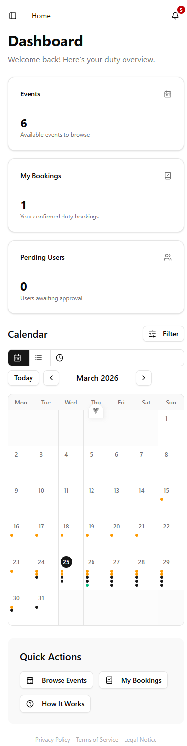
The entire app layout has been reworked for smaller screens. Navigation menus, event views, booking pages, and settings all adapt more cleanly to phones and tablets now. If you've been using the app primarily on a mobile device, this update should feel like a significant step up in usability — less horizontal scrolling, better touch targets, and a layout that actually fits your screen.

Print Support & Multilingual Notifications
Print Your Schedule
Need a paper copy of your upcoming duties? There's now a dedicated print view that formats your schedule in a clean, printer-friendly layout. Open it from the schedule page, hit print, and you're done — great for pinning to a notice board or keeping in your planner.
Multilingual Notifications
Until now, notifications and system messages were always sent in English regardless of your language setting. Starting with this release, all notifications respect your chosen language. If you've set the app to German, your booking confirmations, reminders, and other messages will arrive in German too.
Infrastructure Updates
- Improved authentication token handling for more reliable session management.
Authentication Improvements
- Improved the reliability of the login and authentication process.
Date Filtering & Quick Links
Date Range Filter
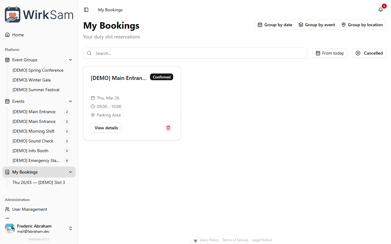
Your bookings and event group views now have a date range picker. Select a start and end date to narrow down exactly the time period you're interested in — no more scrolling through weeks of past events to find what you need.
Sidebar Quick Links
The sidebar has been updated with quick-access links that take you directly to the most commonly used sections of the app. This saves you a few clicks on every visit, especially on pages buried deeper in the navigation.
App Version Display
Version Info in Footer
The app footer now shows the current version number. This makes it easy to check which version you're running — helpful when reporting issues or confirming that an update has been applied.

Event Status Improvements
- Improved how event statuses are tracked and displayed throughout the app, resulting in a more consistent and reliable experience when events change state.
Booking Management Improvements
Smarter Booking Detection
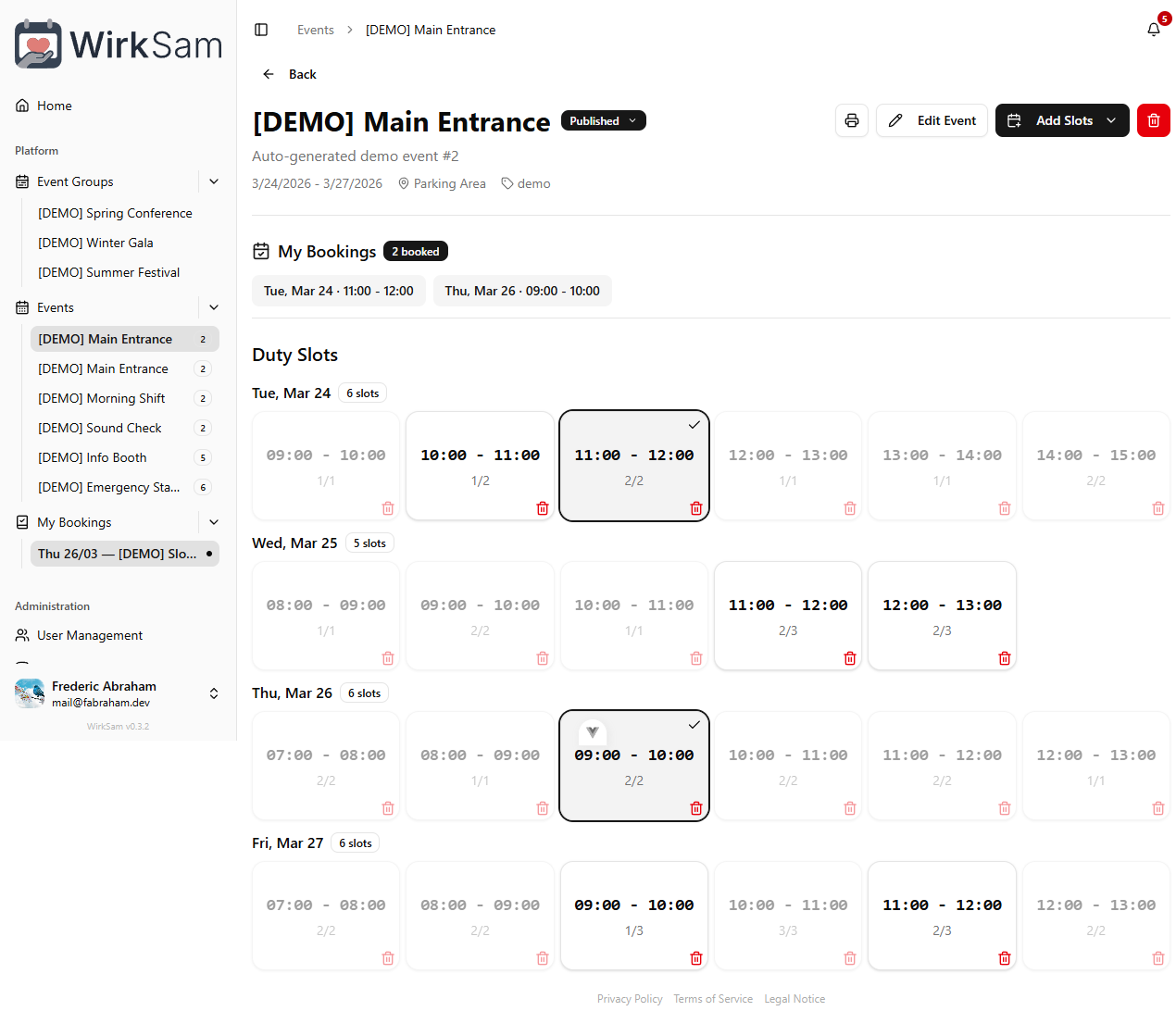
When you open an event, the app now reliably highlights which duty slots you've already booked. Previously, your existing bookings weren't always detected right away, which could make it confusing to tell whether you'd already signed up for a shift. This is now resolved — your bookings are recognized instantly when the event loads.
Deployment Fix
- Fixed an issue that could prevent the app from starting correctly after a fresh deployment.
Legal Pages & Data Privacy
Legal Pages
The app now includes dedicated pages for the imprint and privacy policy, accessible from the footer on every page. These provide the legally required information about the service and how your data is handled.
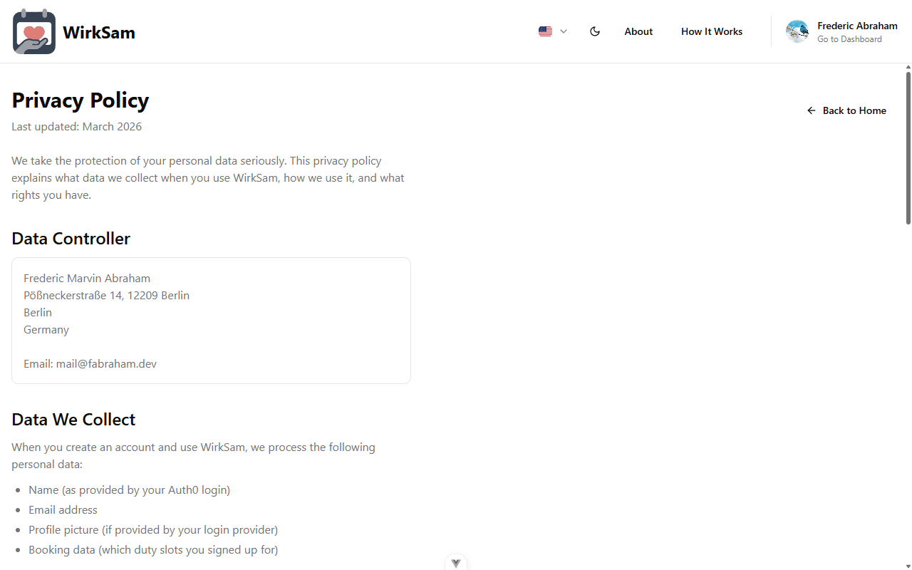
Cookie Notice
On your first visit you'll see a cookie notice explaining what cookies the app uses and why. You can review your cookie preferences at any time.
Personal Data Export
You can now download a copy of all your personal data from your account settings. This gives you full transparency into what information the app stores about you, and helps you stay in control of your data.
Search & Metadata
- Improved how the app appears when shared via links or found through search engines, with better titles, descriptions, and preview images.
- Performance and stability improvements.
Calendar Display Improvements
Improved Duty Calendar
The duty calendar now displays events and event groups more clearly. Related shifts are visually grouped together, making it easier to scan your upcoming schedule and spot open slots without having to click into each event individually.
Notification Channel Controls
Global Notification Toggles
Previously you could only configure notifications one by one. Now there are global toggles that let you turn entire notification channels on or off with a single switch.
Want to silence all email notifications while keeping in-app alerts? Just flip the email toggle off. You can always re-enable it later without losing your individual notification preferences.
Initial Launch
Welcome to the very first release! This is the foundation of the app — everything you need to organize duty shifts and keep your team in sync.
Event & Duty Management
Create events, define duty slots with specific time windows, and let your team members book themselves into shifts. Each event shows how many slots are still open, so you can see at a glance where help is needed.
An infinite-scroll quick view lets you browse upcoming events without leaving the page you're on.
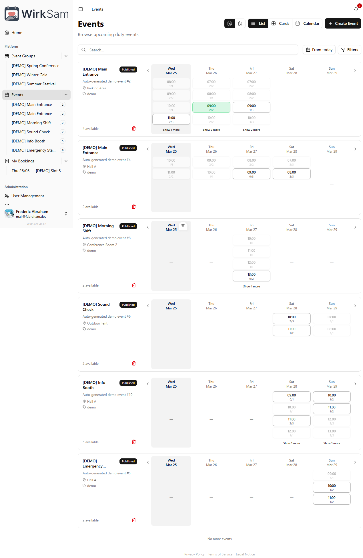
Booking Your Shifts
Open any event to see all available duty slots grouped by day. Slots you've already booked are highlighted with a checkmark, so you always know where you're signed up. Book or cancel with a single click.
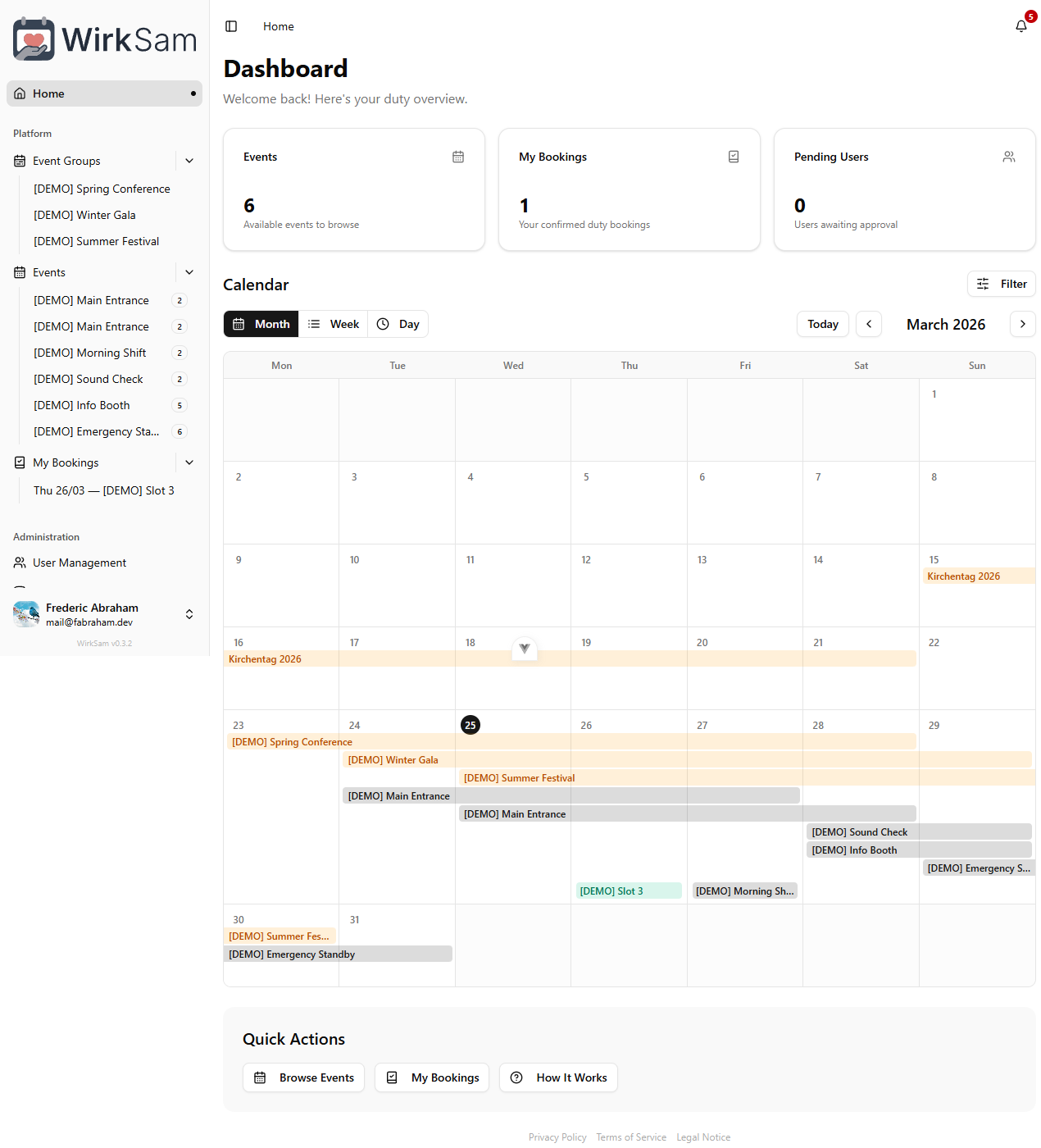
Dashboard
Your personal dashboard gives you a bird's-eye view of everything that matters: how many events are available, your confirmed bookings, and a full calendar showing when duties are scheduled.
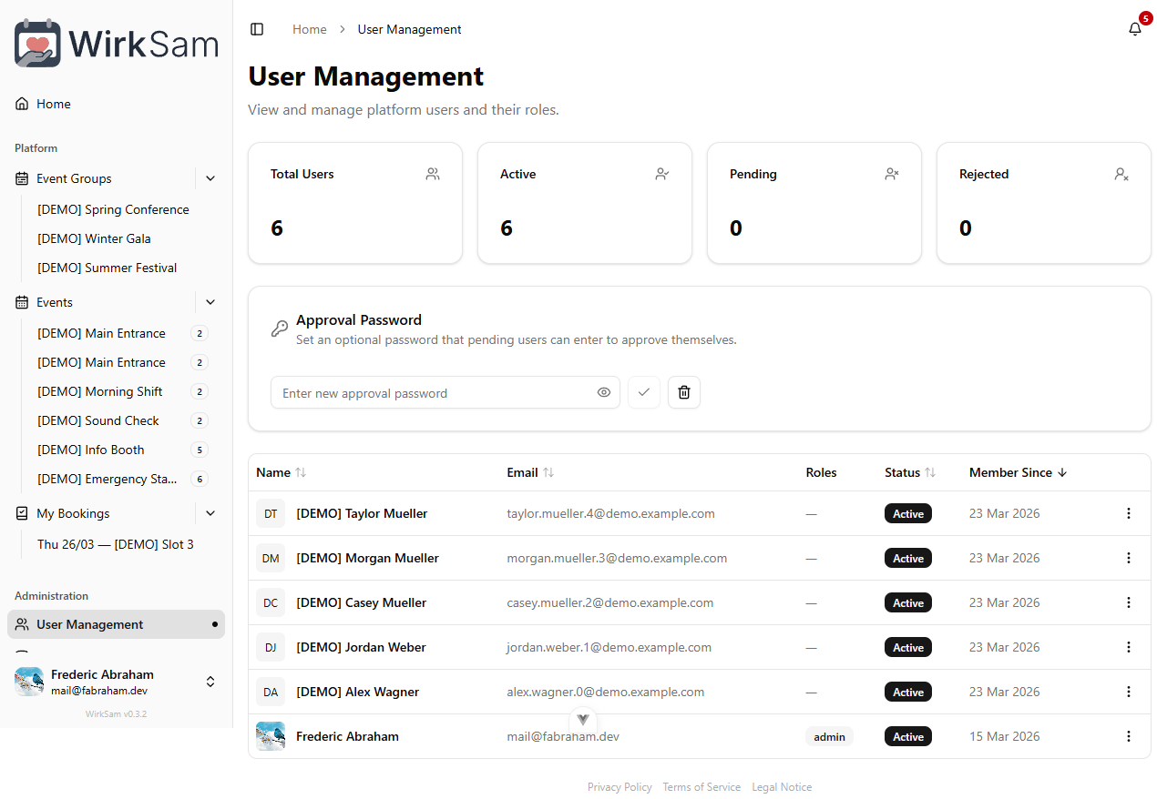
User Accounts & Approval
New users sign up and wait for admin approval before they can access the app. Admins can activate, deactivate, or remove accounts at any time. If you ever want to leave, you can delete your own account and all associated data from the settings page.
Notification Preferences
Choose how you want to be notified about booking confirmations, schedule changes, and upcoming duties. You can fine-tune your preferences from the settings page.
Multi-Language Support
The entire app is available in English and German. Switch languages at any time from your settings — everything updates instantly, including menus, labels, and messages.
Admin Tools
Admins get a dedicated area for managing users and overseeing all events and bookings. There's also a demo data tool for quickly populating the app with sample events and bookings during setup or testing.